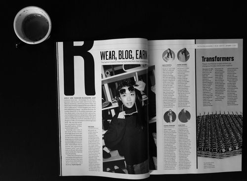
It is important to consider the format and layout of your magazine. Your story matters and we are here to help you format your text in the best way possible. For starters, let's take a look at the two examples underneath together. Both examples have a different format and layout of elements on the page. Which of the two would you rather spend time reading? Why do you think that is? In this case, we find the text on the white background more legible compared to the other example because the contrast is greater without any background noise. We also think it is easier to read since the text is divided into columns and we perceive the photo better without text overlay. By choosing a simple background for the text and using columns, you can improve the legibility of your content.
spain-layout&text-example.jpg
Here are 4 other ways you can improve your text legibility:
Use a simple font
A simple font for your body text will give you a higher chance of legibility. To highlight your paragraph headlines, you can experiment with different fonts, or by making them bold, cursive, or perhaps in a different color.
Divide your story up into paragraphs with paragraph titles
We usually divide text into paragraphs and create some space in between the paragraphs. Not only does this make the text easier on the eyes, but it also looks better on the page. Keep in mind the length of your sentences because if sentences are too complicated to understand or get through, your reader may give up.
Use font size to your advantage
Figuring out which font size reads best, is sometimes a process of trial and error. However, we have experienced that the best font size for text is size10. Keep in mind that the font size may be different on screen than in the printed version of your magazine. Experiment with varying font sizes for titles, subtitles, paragraph titles, and quotes to help keep the text interesting for readers.
Use text borders or other elements
Isolating some text by adding a border or another element, gives you the option to highlight key information within the text. For example, it is a great way to showcase facts and figures. The use of a border keeps your text clean and makes important information easy to spot. While at the same time, a great way to change things up on your page, keeping the reader entertained and interested.
Also, less is more. We may think it sounds cliche, but that does not mean it is not true. Less really is more.
Sophie-de-vries-resume-example.jpg